Note: this is the second part of a two-post series where I “fix” some of the problems with crowd-sourced ratings, like those you find for movies or books. (In this series, I look at children’s books.) In the first part, I incorporated a Bayesian prior into the rating calculation to address books with very few ratings sometimes having extreme scores (like 5 out of 5 stars) that likely don’t reflect their actual quality.
In part two of this two-part series, we will normalize and rescale children’s books ratings to them easier to interpret. To do this, we need to force our empirical distribution into a normal distribution. We will end up with something like this (just replace “movies” with “books” – image is from Whose ratings should you trust?):
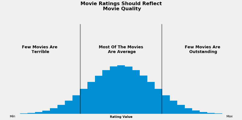
Why normalize ratings at all? Normal distributions have some properties that make them easy to interpret. First, the normal distribution has the same mean, median, and mode, three common measures of central tendency. This gives us a strong “typical rating” which we set in the middle of our range: 3 stars. So a perfectly average book will have a rating of exactly 3 stars. Plus, there will be an equal proportion of books above and below 3 stars.
Second, the normal distribution has nice dispersion: most books will be close to average, but we will have a few extremely bad or extremely good books that are close to 1 or 5 stars, respectively. This fits with the intuition of having extremely good or bad books being fairly rare.
However, normalization is a judgement call. There are good arguments against normalizing ratings. One argument is that normalization forces ratings into how we think they should be distributed instead of how they actually are distributed. So by normalizing, we’re shifting and tweaking ratings in a way that makes them less accurate.
Another argument is that the issues with ratings that we outlined in the first post are so common that people have already adjusted their mental models of ratings to take them into account. For example, on a 1-5 star scale, we would already expect an “average” books to be around 4 stars even though the middle of range is technically 3 stars; a 4-star average isn’t misleading because it’s expected. Under this argument, we’re messing with that existing mental model by aligning the average rating with the middle of the scale. We’re actually making ratings harder for people to interpret.
I think the arguments for normalization are more compelling for the arguments against, so I’m comfortable making the call to do it. Just know that it shouldn’t be an automatic decision – you should consider whether it’s appropriate to the specific problem you want to solve.
Setup
Let’s start putting these concepts into action. We’ll load our packages and import our data. In addition to the tidyverse, we’ll use:
bestNormalizefor normalization functionsscalesfor useful rescaling functionsextrafontto make our graphs look nicegganimateto visualize what exactly empirical Bayes estimation does to the ratingsknitrandkableExtrato get nicely-formatted tables for this post (not necessary if you’re just doing this in RStudio)
library(tidyverse)
library(bestNormalize)
library(scales)
library(extrafont)
library(gganimate)
library(knitr)
library(kableExtra)

theme_set(theme_light())

# Data is the output of part one of this series
books_eb <- read_tsv("https://raw.githubusercontent.com/tacookson/data/master/childrens-book-ratings/childrens-books-empirical-bayes-ratings.txt") %>%
  select(-rating_count, -rating_calc)
What’s wrong with the original ratings?
As a reminder, here is what our data looks like. We have some essential information about the book, like ISBN and title, and the empirical Bayes rating we calculated in the first post. (I’m going to call this the “Original” rating because we reference it a lot and it’s a bit cumbersome to write “Empirical Bayes rating” every time.)
# For reproducability
set.seed(24601)

books_eb %>%
  sample_n(4) %>%
  kable(format = "html") %>%
kable_styling()| isbn | title | author | rating_eb |
|---|---|---|---|
| 0979430224 | Giraffe Sounds? | Debbie Buttar (Author), Christopher Davis (Illustrator) | 4.097605 |
| 0590437852 | Meet Molly: An American Girl | Valerie Tripp (Author) | 3.936307 |
| 0385373112 | Earth Space Moon Base | Ben Joel Price (Author) | 3.303913 |
| 0140549072 | Something Else | Kathryn Cave | 4.445791 |
Ratings don’t have extreme values anymore, but the distribution is still tight and uses less than half of the full 1-5 star range. There are literally no books with a rating less than 3 stars, so, in practice, it is a 3-5 star range:
books_eb %>%
  ggplot(aes(rating_eb)) +
  geom_histogram(binwidth = 0.1, fill = "#461220", alpha = 0.8) +
  scale_y_continuous(labels = label_comma()) +
  expand_limits(x = 1) +
  labs(title = "Most of the 1-5 star range is unused",
       subtitle = "Ratings are concentrated around 4 stars, without much variance",
       x = "Original rating",
       y = "Number of books") +
  theme(text = element_text(family = "Bahnschrift"),
        plot.title = element_text(size = 18),
        axis.text = element_text(size = 16))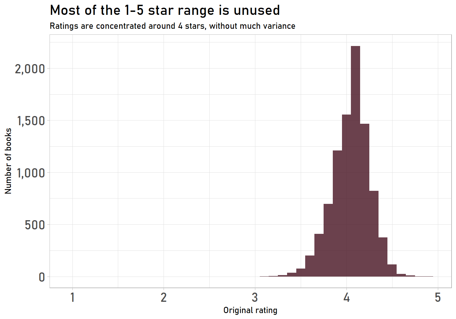
That’s not very intuitive. If someone told me a book had a 3/5 star rating, I would think, “It sounds like an okay, but not great, book”. Under this distribution, a 3/5 star rating would make that book the worst one of over 9,000!
Why can’t we just rescale?
Before we jump into normalization, it’s worth looking at what happens if we only rescale to use the full 1-5 scale, without normalizing. After all, our big issue is that we’re not using the full range. Can’t we extend our ratings to fit that range and not worry about messing around with normal distributions?
Yes, we can.
Think of rescaling as a two-step process:
- “Squeezing” or “stretching” the data to fit our target range (“squeeze” to make the range smaller; “stretch” to make the range larger)
- “Shifting” the data up or down to fit our target minimum and maximum
Our original ratings have a minimum of 3.05 and a maximum of 4.89, which means a range of 1.84. Our target distribution has a minimum of 1 and a maximum of 5, meaning a range of 4. So rescaling stretches the narrow (original) range to the wide (target) range, then shifts that stretched data so that it has a minimum of 1 and a maximum of 5.
Fortunately, the scales package’s rescale() function takes care of the heavy lifting for us. (But if you’re curious about the specific calculation, look at this StackOverflow thread.)
scaled <- books_eb %>%
  # Use the "to" argument to set target min and max (range is implicit)
  mutate(scaled_eb = rescale(rating_eb, to = c(1, 5)))
We can also visualize the stretching step of rescaling by looking at the mean-centred values of the original vs. the rescaled data. Mean-centred values get rid of the effects of the shifting step, which we won’t go into detail on since it is more straightforward.
# Get data in format to be animated
scaled_anim <- scaled %>%
  select(isbn, rating_eb, scaled_eb) %>%
  mutate(rating_eb_mean_centred = rating_eb - mean(rating_eb),
         scaled_eb_mean_centred = scaled_eb - mean(scaled_eb)) %>%
  pivot_longer(rating_eb_mean_centred:scaled_eb_mean_centred, names_to = "scale", values_to = "rating") %>%
  mutate(scale = ifelse(scale == "rating_eb_mean_centred", "Original", "Rescaled"))

# Create base plot
p_rescaling <- scaled_anim %>%
  ggplot(aes(rating)) +
  geom_histogram(binwidth = 0.1, fill = "#778DA9", alpha = 0.8) +
  scale_y_continuous(labels = label_comma()) +
  labs(subtitle = "Rescaling \"stretches\" ratings to fill the wider range",
       x = "Mean-centred star rating",
       y = "Number of books") +
  theme(text = element_text(family = "Bahnschrift", size = 6),
        plot.title = element_text(size = 9),
        axis.text = element_text(size = 7),
        panel.grid.minor.y = element_blank())

# Set animation parameters
anim_rescaling <- p_rescaling +
  transition_states(scale,
                    transition_length = 1.5,
                    state_length = 1.5) +
  shadow_mark(past = TRUE, future = TRUE, alpha = 0.2) +
  ggtitle("{previous_state}")

# Create animation
anim_rescaling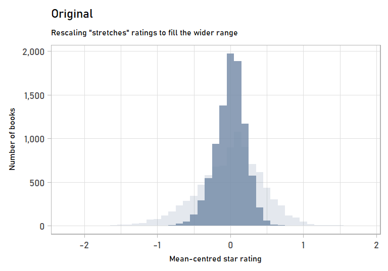
And here’s the completely rescaled data:
# Calculate rescaled mean to add a reference line
rescaled_mean <- mean(scaled$scaled_eb)

scaled %>%
  ggplot(aes(scaled_eb)) +
  geom_histogram(binwidth = 0.1, fill = "#461220", alpha = 0.8) +
  geom_vline(xintercept = rescaled_mean, lty = 2, size = 1.5, col = "white") +
  expand_limits(x = 1) +
  annotate("text", x = 3.12, y = 60,
           label = paste0("Mean rating = ", number(rescaled_mean, accuracy = 0.01)),
           family = "Bahnschrift",
           colour = "white",
           size = 4.5,
           hjust = 1) +
  labs(title = "Rescaled data is still skewed",
       subtitle = "Mean is still not centred at 3 stars",
       x = "Rescaled star rating",
       y = "Number of books") +
  theme(text = element_text(family = "Bahnschrift"),
        plot.title = element_text(size = 18),
        axis.text = element_text(size = 16))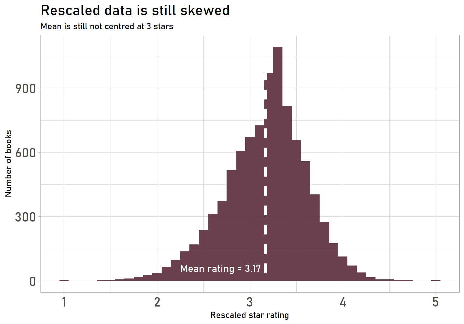
It looks pretty good! We’re using the full range, meaning it’s easier to discriminate between good and bad books (according to the ratings, at least). We could easily stop here and be happy with our result, but I’m really keen to have 3 stars be the exact middle of the distribution. On to normalization!
Normalizing the ratings
As discussed in the introduction, the normal distribution has strong, centred “typical rating” and symmetrical dispersion. But how do we actually convert the original distribution to a normal distribution?
With ordered quantile normalization, that’s how! It sounds scary, but it’s not too bad. We take our original ratings, put them in order, then rank them from lowest to highest. Then, we create a new set of values that is normally-distributed and has the same number of data points. (In our case, 9,240 book ratings = 9,240 normally-distributed values.) We put them in order then rank them.
Now we have two sets of ranks: our original ratings and some normally-distributed values. We use rank to match up our original ratings with the normally-distributed values. So the book with the 452nd-highest rating in the original data will match with the 452nd-highest value in the normally-distributed data. Whatever value we matched up to in the normally-distributed values is that book’s new rating. Easy! (But if you like, Josh Starmer explains it more thoroughly in this StatQuest video.)
That’s the concept. Now let’s talk implementation. We are going to use the orderNorm() function from Ryan Peterson’s bestNormalize package. Like rescale(), it takes care of the heavy lifting for us. Here’s the plan:
- Create an ordered quantile regression model using our original ratings with
orderNorm() - Get the normalized values from the model using
predict() rescale()those normalized values to our desired range of 1-5 stars (the normalized values from (2) use a standard normal distribution, which is centred at zero)- Add the normalized, rescaled ratings to our original dataset with
bind_cols()
# Use orderNorm() from {bestNormalize} package for ordered quantile normalization
ordered_quantile_model <- orderNorm(books_eb$rating_eb, warn = FALSE)

# Create tibble with normalized fitted values, then rescale those values to 1-5 range
normalized <- tibble(rating_norm = predict(ordered_quantile_model)) %>%
  transmute(scaled_norm = rescale(rating_norm, to = c(1, 5)))

# Add normalized ratings as a field to our data
scaled_norm <- bind_cols(scaled, normalized)
Now we have normalized ratings! They’re pretty close to the rescale-only ratings. But we’ve massaged them just a bit to get them to fit a normal curve:
# Get data in format to be animated
scaled_anim <- scaled_norm %>%
  select(isbn, scaled_eb, scaled_norm) %>%
  pivot_longer(-isbn, names_to = "scale", values_to = "rating") %>%
  mutate(scale = ifelse(scale == "scaled_eb", "Rescaled", "Rescaled + Normalized"))

# Create base plot
p_normalizing <- scaled_anim %>%
  ggplot(aes(rating)) +
  geom_histogram(binwidth = 0.1, fill = "#778DA9", alpha = 0.8) +
  labs(subtitle = "Normalization \"squeezes\" ratings to fill out the low end of the distribution",
       x = "Scaled star rating",
       y = "Number of books") +
  theme(text = element_text(family = "Bahnschrift", size = 6),
        plot.title = element_text(size = 9),
        axis.text = element_text(size = 7),
        panel.grid.minor.y = element_blank())

# Set animation parameters
anim_normalizing <- p_normalizing +
  transition_states(scale,
                    transition_length = 1.5,
                    state_length = 1.5) +
  shadow_mark(past = TRUE, future = TRUE, alpha = 0.2) +
  ggtitle("{previous_state}")

# Create animation
anim_normalizing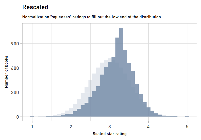
And now we reap the benefits of our hard work! Here is a random selection Terrible to Great books according to our normalized ratings:
# For reproducability
set.seed(25624)

scaled_norm %>%
  mutate(quality = case_when(scaled_norm < 1.5 ~ "Terrible",
                             scaled_norm < 2 ~ "Bad",
                             scaled_norm < 3 ~ "Below Average",
                             scaled_norm < 4 ~ "Above Average",
                             scaled_norm < 4.5 ~ "Good",
                             TRUE ~ "Great")) %>%
  group_by(quality) %>%
  sample_n(1) %>%
  ungroup() %>%
  arrange(scaled_norm) %>%
  transmute(Quality = quality,
            Book = title,
            Author = author,
            Rating = number(scaled_norm, accuracy = 0.01)) %>%
  kable(format = "html") %>%
kable_styling()| Quality | Book | Author | Rating |
|---|---|---|---|
| Terrible | Earth Space Moon Base | Ben Joel Price (Author) | 1.42 |
| Bad | I Will Chomp You! | Jory John, Bob Shea (Illustrator) | 1.88 |
| Below Average | Possum and the Summer Storm | Anne Hunter (Author) | 2.25 |
| Above Average | Ice Cream Kitty | Nerina DiBenedetto (Author), Martha Houghton (Illustrations) | 3.16 |
| Good | The Rabbit Listened | Cori Doerrfeld | 4.23 |
| Great | Homicidal Psycho Jungle Cat | Bill Watterson | 4.65 |
Conclusion
In the first post of this series, we incorporated a Bayesian prior into our children’s book ratings. In this post, we normalized the ratings to use the full 1-5 star scale and follow a normal curve This made for a nice distribution of ratings, with values that are easy to interpret.
If you’d like to explore or download the full dataset of normalized ratings, you can do so here.
In the meantime, why not check out some great children’s books? I hear Homicidal Psycho Jungle Cat is supposed to be pretty good!