In this post, I analyze the National Park Visits dataset from TidyTuesday, a project that shares a new dataset each week to give R users a way to apply and practice their skills. This week’s data is about visitor numbers for US National Parks, going way back to 1904, when there were only six national parks.
I’ve never been to a US national park, but I know about some of the famous ones like Yosemite and Yellowstone. Maybe this dataset will give me some ideas for lesser-known parks to visit!
Setup
First, we’ll load the tidyverse and, because I cheated and looked ahead, a few other packages:
lubridateto work with datesggrepelto add text labels to graphs that won’t overlapggscifor interesting colour palettes
In addition to visitor figures, TidyTuesday has state population data. This will be useful if we want to look at the relationship between park visitors and population (spoiler: we do exactly this).
library(tidyverse)
library(lubridate)
library(ggrepel)
library(ggsci)

theme_set(theme_light())

park_visits_raw <- readr::read_csv("https://raw.githubusercontent.com/rfordatascience/tidytuesday/master/data/2019/2019-09-17/national_parks.csv")
state_pop <- readr::read_csv("https://raw.githubusercontent.com/rfordatascience/tidytuesday/master/data/2019/2019-09-17/state_pop.csv")
Data inspection
Let’s take a look.
park_visits_raw %>%
  glimpse()
## Rows: 21,560
## Columns: 12
## $ year <chr> "1904", "1941", "1961", "1935", "1982", "1919", "...
## $ gnis_id <chr> "1163670", "1531834", "2055170", "1530459", "2772...
## $ geometry <chr> "POLYGON", "MULTIPOLYGON", "MULTIPOLYGON", "MULTI...
## $ metadata <chr> NA, NA, NA, NA, NA, NA, NA, NA, NA, NA, NA, NA, N...
## $ number_of_records <dbl> 1, 1, 1, 1, 1, 1, 1, 1, 1, 1, 1, 1, 1, 1, 1, 1, 1...
## $ parkname <chr> "Crater Lake", "Lake Roosevelt", "Lewis and Clark...
## $ region <chr> "PW", "PW", "PW", "PW", "PW", "NE", "IM", "NE", "...
## $ state <chr> "OR", "WA", "WA", "WA", "CA", "ME", "TX", "MD", "...
## $ unit_code <chr> "CRLA", "LARO", "LEWI", "OLYM", "SAMO", "ACAD", "...
## $ unit_name <chr> "Crater Lake National Park", "Lake Roosevelt Nati...
## $ unit_type <chr> "National Park", "National Recreation Area", "Nat...
## $ visitors <dbl> 1500, 0, 69000, 2200, 468144, 64000, 448000, 7387...We have four types of data:
- Park metadata like name, official name (
unit_name), and type of park - Visitors by year
- Mapping data about shapefile shapes and IDs
- Data export artefact:
number_of_recordsis 1 in every row. This type of metadata appears a lot when downloading data from data portals.
Okay, what about state_pop?
state_pop %>%
  glimpse()
## Rows: 5,916
## Columns: 3
## $ year <dbl> 1900, 1901, 1902, 1903, 1904, 1905, 1906, 1907, 1908, 1909, 1...
## $ state <chr> "AL", "AL", "AL", "AL", "AL", "AL", "AL", "AL", "AL", "AL", "...
## $ pop <dbl> 1830000, 1907000, 1935000, 1957000, 1978000, 2012000, 2045000...That’s as straightforward as it gets. Population by year for each state.
I want to know, How popular have national parks been over time? I would guess that it has increased since 1904, as the park system expanded and it became easier and less expensive to visit them.
Data cleaning
I’m going to do four cleaning steps:
- Ditch fields won’t be useful in answering our research question.
- Rename
unit_codetopark_codeso that it’s more intuitive. yearhas a row for “Totals”, so we will get rid of that. (If we need totals, we can calculate it ourselves.)- Create long (more readable) version
regioncodes to full names, based on National Park Service (NPS) Regional Boundaries.
park_visits <- park_visits_raw %>%
  # 1. Ditch GIS fields and metadata artefact
  select(-number_of_records, -gnis_id, -geometry, -metadata) %>%
  # 2. Rename park ID field
  rename(park_code = unit_code) %>%
  # 3. Get rid of aggregate row
  filter(year != "Total") %>%
  # Convert year to number (was character because of "Total")
  mutate(year = as.numeric(year),
  # 4. Create long version of region (note the backticks for values with spaces)
         region_long = fct_recode(region,
                                  Alaska = "AK",
                                  Midwest = "MW",
                                  `Pacific West` = "PW",
                                  Intermountain = "IM",
                                  Northeast = "NE",
                                  Southeast = "SE",
                                  `National Capital` = "NC"))
We’ve got cleaner, more workable data now. But there is still an issue I’d like to address. There is a region code that wasn’t in the NPS legend: NT
park_visits %>%
  filter(region == "NT") %>%
  distinct(unit_name, unit_type, region)
## # A tibble: 1 x 3
## region unit_name unit_type
## <chr> <chr> <chr>
## 1 NT Blue Ridge Parkway ParkwayBlue Ridge Parkway. According to Blue Ridge’s Wikipedia page, it is a parkway (duh) that runs through Virginia and North Carolina, which are in different NPS regions. (Virginia is in “Northeast” and North Carolina is in “Southeast”.) “NT” is probably a special classification or a code that means “not classified”.
This discovery makes me question whether to include any parkways in our analysis. When I think of visiting national parks, I think of people getting out of their cars, going into visitors’ centres, and hiking trails. Are there any other parkways in our data?
park_visits %>%
  filter(str_detect(unit_type, "Parkway")) %>%
  distinct(unit_name, unit_type, region)
## # A tibble: 4 x 3
## region unit_name unit_type
## <chr> <chr> <chr>
## 1 NT Blue Ridge Parkway Parkway
## 2 IM John D. Rockefeller, Jr., Memorial Parkway National Parkway
## 3 NC George Washington Memorial Parkway National Parkway
## 4 SE Natchez Trace Parkway ParkwayYes, three more:
I’m going to exclude these because, even though they are administered by the NPS, “visiting” a parkway doesn’t fit with how I think of visiting a national park. (You can make the argument that I’m wrong to exclude them or that I should exclude more than just parkways based on my logic. I’m doing a quick exploration, so I’m comfortable making this decision based my assumption. But if I were analyzing this dataset in detail, I would do more research before making a decision to exclude data.)
park_visits <- park_visits %>%
  filter(!str_detect(unit_type, "Parkway"))
Visualization
Total visits
Our question is, How popular have national parks been over time? Let’s start with total visitors. But before we, do, we need to talk about US population. According to our state_pop dataset, the population was 82 million in 1904 (the earliest year we have park visit data) and 321 million in 2015 (the latest year we have population data).
state_pop %>%
  filter(year == 1904 | year == 2015) %>%
  group_by(year) %>%
  summarise(pop_millions = sum(pop, na.rm = TRUE) / 1e6) %>%
  ggplot(aes(as.factor(year), pop_millions)) +
  geom_col(fill = "royal blue") +
  scale_y_continuous(breaks = seq(0,300, 50),
                     labels = paste0(seq(0, 300, 50), "M")) +
  labs(title = "US Population in millions, 1900-2015",
       x = "",
       y = "") +
  theme(panel.grid.major.x = element_blank(),
        panel.grid.minor.y = element_blank())
## `summarise()` ungrouping output (override with `.groups` argument)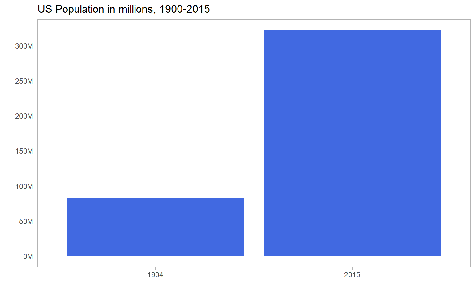
I’m interested in the popularity of national parks, not just their raw visitor numbers, so it wouldn’t be fair to compare 1904 visits to 2015 visits. There were way more people in 2015 to do the visiting! So I’m going to scale visitors by US population (e.g., “X visits per 1,000 US population”). Scaling this way doesn’t account for non-US visitors, but it should be approximate enough to account for the fact that fewer people were walking around in 1904 than 2015.
total_visits <- state_pop %>%
  group_by(year) %>%
  summarise(total_population = sum(pop, na.rm = TRUE)) %>%
  # Filters out years that aren't in park_visits data (pre-1904)
  right_join(park_visits, by = "year") %>%
  group_by(year) %>%
  summarise(total_visitors = sum(visitors),
            # Already calculated and identical, so taking mean gives total population
            total_population = mean(total_population),
            visits_per_thousand = total_visitors / (total_population / 1000)) %>%
  # Remove years that aren't state_pop dataset (post-2015)
  filter(!is.na(total_population))
## `summarise()` ungrouping output (override with `.groups` argument)
## `summarise()` ungrouping output (override with `.groups` argument)total_visits %>%
ggplot(aes(year, visits_per_thousand)) +
geom_hline(yintercept = 1000, lty = 2) +
geom_line(col = "dark green", size = 1.5) +
geom_area(fill = "dark green", alpha = 0.25) +
scale_x_continuous(breaks = seq(1900, 2010, 10)) +
scale_y_continuous(breaks = seq(0, 1200, 200)) +
labs(title = "How popular have national parks been?",
subtitle = "1904-2015. Dashed line represents an equal number of visitors and population",
x = "",
y = "Visitors per thousand US population")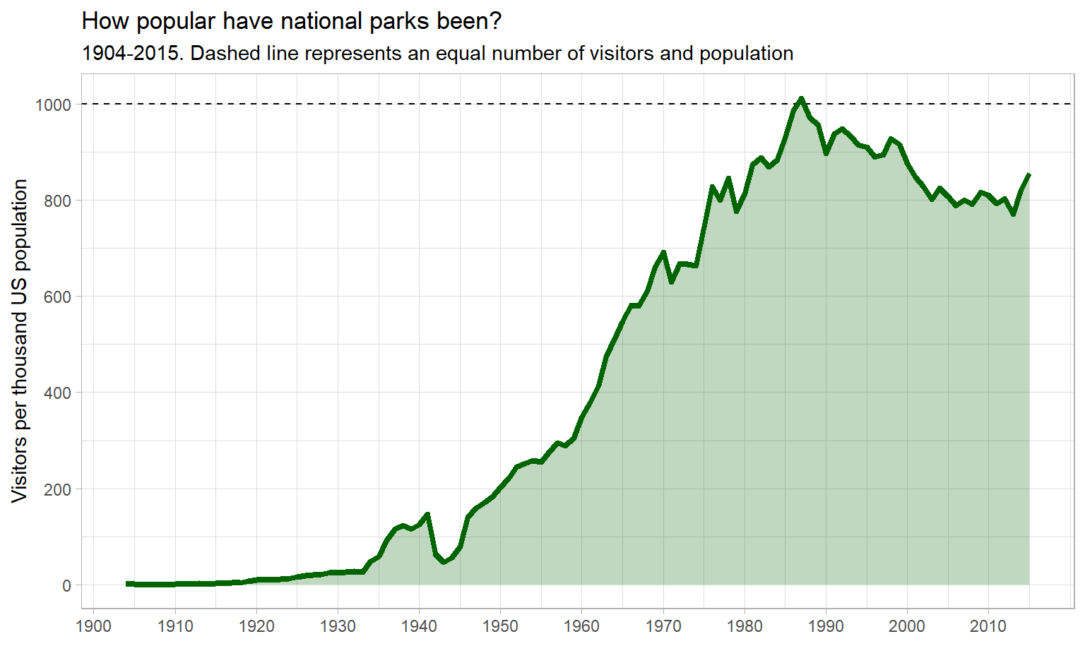
(I saw FiveThirtyEight’s graph and liked it so much I stole the aesthetics. They didn’t scale by population, though!)
Visits in the early 20th century were low (real low!), with a notable dip during the US involvement in World War II. Then visits increase until they peak in the mid 1980s. After that, there is a steady-ish decline with a possible uptick in the mid-2010s.
Visits by region
How does this time trend look when broken down by region? I’m going to do something similar to what we did for total visits, with one difference – aggregate visitors per thousand into five-year bins. Graphing annually gives spiky, noisy lines. I’m more interested in the overall trend, so I’m going to sacrifice detail and accuracy to get a graph that’s easier to read.
visits_by_region <- state_pop %>%
  group_by(year) %>%
  summarise(total_population = sum(pop, na.rm = TRUE)) %>%
  right_join(park_visits, by = "year") %>%
  # Truncated division to floor the year into 5-year bins
  mutate(year = year %/% 5 * 5) %>%
  group_by(year, region_long) %>%
  summarise(total_visitors = sum(visitors),
            total_population = mean(total_population),
            visits_per_thousand = mean(total_visitors / (total_population / 1000))) %>%
  filter(!is.na(total_population)) %>%
  ungroup()
## `summarise()` ungrouping output (override with `.groups` argument)## `summarise()` regrouping output by 'year' (override with `.groups` argument)visits_by_region %>%
# Add region labels for the max year
mutate(region_label = ifelse(year == max(year), as.character(region_long), NA_character_),
region_label = fct_reorder(region_label, visits_per_thousand, last, order_by = year)) %>%
ggplot(aes(year, visits_per_thousand, col = region_long)) +
geom_line(size = 1) +
# From ggrepel package to keep labels from overlapping
geom_label_repel(aes(label = region_label), nudge_x = 10, na.rm = TRUE) +
# Colour palette from ggsci package
scale_color_jco() +
scale_x_continuous(breaks = seq(1900, 2010, 10)) +
# Gives space on right side of graph for labels
expand_limits(x = 2030) +
labs(title = "How has the popularity of national park regions changed?",
subtitle = "By number of visits per thousand US residents. Aggregated into 5-year bins.",
x = "",
y = "Visitors per thousand US population") +
theme(legend.position = "none",
panel.grid.minor = element_blank())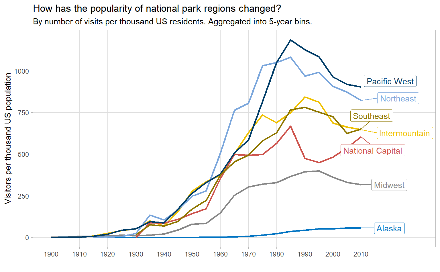
When we break down by region, we see a few things:
- Alaska: few visits and a gradual, smooth increase since the 1960s
- Midwest: middling visits and smooth increaseses and decreases
- All other regions: many visits and some spiky-ness, with peaks in the late 1980s or early 1990s
The spike in visits in the late 1980s is particularly stark. After some cursory research, I can’t figure out why. An important anniversary? A period of low (or no) entry fees? If you know or have any ideas, tweet me.
Conclusion
If you liked this, check out the #TidyTuesday hashtag on Twitter. People make truly wonderful contributions every week. Even better would be to participate in TidyTuesday. The R community is tremendously positive and supportive.