I love musicals! Who doesn’t?! That feeling when the lits dim at the beginning of the show. The intermission conversation (post-bathroom!) of which songs you enjoyed the most. Spending the rest of the week (maybe month?) humming your favourites to the annoyance of everyone around you.
What’s that? Les Misérables is obviously the best musical? I know, I know. I mean, Hamilton is good and all that, and it deserves praise, but it’s no Les Mis (don’t @ me).
Speaking of Hamilton, have you ever wondered how much money it and other Broadway shows have made? Or whether any other shows have come even close to Hamilton’s record-breaking ticket prices? We’re going to investigate exactly those questions today:
- What are the most successful Broadway shows?
- How have ticket prices changed over time?
Setup
First, we’ll load the tidyverse and other useful packages:
lubridatefor working with datesscalesfor making numbers pretty (e.g., turning 5e6 into 5,000,000 or 5M)fishualizefor some of my favourite ggplot colour palettes (and recently updated to version 0.2.0)extrafontfor using additional font options for graphs
Then we’ll import our data. We’re using weekly box office grosses from Playbill and Consumer Price Index (CPI) data from the U.S. Bureau of Labor Statistics. If you want more details on data collection or the data itself, take a look at the README on GitHub.
library(tidyverse)
library(lubridate)
library(scales)
library(fishualize)
library(extrafont)

theme_set(theme_light())

# Adding guess_max = 10000 show readr gets the column specifications right
grosses_raw <- readr::read_csv("https://raw.githubusercontent.com/tacookson/data/master/broadway-grosses/grosses.csv",
                            guess_max = 10000)
cpi_raw <- readr::read_csv("https://raw.githubusercontent.com/tacookson/data/master/broadway-grosses/cpi.csv")
Data inspection
Our main dataset is grosses_raw. What treasure lies inside?
glimpse(grosses_raw)## Rows: 47,524
## Columns: 14
## $ week_ending <date> 1985-06-09, 1985-06-09, 1985-06-09, 1985-06-0...
## $ week_number <dbl> 1, 1, 1, 1, 1, 1, 1, 1, 1, 1, 1, 1, 1, 1, 1, 1...
## $ weekly_gross_overall <dbl> 3915937, 3915937, 3915937, 3915937, 3915937, 3...
## $ show <chr> "42nd Street", "A Chorus Line", "Aren't We All...
## $ theatre <chr> "St. James Theatre", "Sam S. Shubert Theatre",...
## $ weekly_gross <dbl> 282368, 222584, 249272, 95688, 61059, 255386, ...
## $ potential_gross <dbl> NA, NA, NA, NA, NA, NA, NA, NA, NA, NA, NA, NA...
## $ avg_ticket_price <dbl> 30.42, 27.25, 33.75, 20.87, 20.78, 31.96, 28.3...
## $ top_ticket_price <dbl> NA, NA, NA, NA, NA, NA, NA, NA, NA, NA, NA, NA...
## $ seats_sold <dbl> 9281, 8167, 7386, 4586, 2938, 7992, 10831, 567...
## $ seats_in_theatre <dbl> 1655, 1472, 1088, 682, 684, 1018, 1336, 1368, ...
## $ pct_capacity <dbl> 0.7010, 0.6935, 0.8486, 0.8405, 0.5369, 0.9813...
## $ performances <dbl> 8, 8, 8, 8, 8, 8, 8, 8, 8, 8, 8, 8, 8, 9, 0, 8...
## $ previews <dbl> 0, 0, 0, 0, 0, 0, 0, 0, 0, 0, 0, 0, 0, 0, 8, 0...We have four types of data:
- Dates, like the week in question and the week number of the Broadway season (which starts after the Tony Awards in early June)
- Show and theatre data, like the name of the show and the theatre capacity
- Performance data, like the number of performances in a given week, the seats sold, and the percent capacity for the week
- Money data, like ticket prices, box office grosses, and a show’s potential weekly gross
I’ve compiled a data dictionary if you want the details of specific fields.
The second dataset, cpi_raw is a helper dataset to adjust dollar figures for inflation. Our data spans 35 years and $50 in 1985 goes farther than it does in 2020!
glimpse(cpi_raw)## Rows: 423
## Columns: 2
## $ year_month <date> 1985-01-01, 1985-02-01, 1985-03-01, 1985-04-01, 1985-05...
## $ cpi <dbl> 107.1, 107.7, 108.1, 108.4, 108.8, 109.1, 109.4, 109.8, ...These are straightforward: the value of the Consumer Price Index (CPI) for each month since January 1985. There are tons of different CPI measures, but I used “All items less food and energy in U.S. city average, all urban consumers, seasonally adjusted”. I think it gets us closest to the purchasing power of a New York City theatre-goer.
Data cleaning
Before we can answer our questions, we need to do some data cleaning. Specifically, we need to:
- Identify missing values
- Add a field for what week of a run a show is on (this one’s tricky – keep reading)
- Convert nominal dollars to real dollars
Identify missing values
Don’t blindly trust data you didn’t collect yourself. A lot of the time, a quick look will shine a light on quirks that could mess up your analysis down the line and this data isn’t any different. I took that quick look and identified a few circumstances to change values to NA (missing values):
- Measures like
weekly_grossandseats_soldsometimes have values of zero for weeks where there were no performances - These measures also sometimes have zeros for weeks when there were performances – I checked this out and it seems to be data missing from the source
top_ticket_pricesometimes has values in weeks with no performances
grosses_fixed_missing <- grosses_raw %>%
  # Turn metrics into missing values if there were no shows
  # OR if metrics have a value of zero
  mutate_at(vars(weekly_gross:pct_capacity),
            ~ ifelse(performances + previews == 0 | . == 0, NA, .))
Changing these to missing values will keep us from accidentally incorporating zeros into, say, calculating an average. If we did include the zeros, they could erroneously skew our numbers downward. (There is the possibility that the data showing weeks without any performances is wrong itself, but based on some spot-checking and research, I’m comfortable making the assumption the we’re just dealing with missing or wonky data from the source.)
Add week of show’s run
Remember when I said this one’s tricky? There are two reasons why. To illustrate the first, let’s look at Les Misérables. Here’s a quick graph of seats sold by week (with a bonus illustration of using scale_x_date() to adjust date axis labels).
grosses_fixed_missing %>%
  filter(show == "Les Miserables") %>%
  ggplot(aes(week_ending, seats_sold)) +
  geom_col() +
  scale_x_date(date_breaks = "5 years", date_labels = "%Y") +
  labs(title = "Two-four-six-oh-what??",
       subtitle = "Seats sold by week for Les Misérables")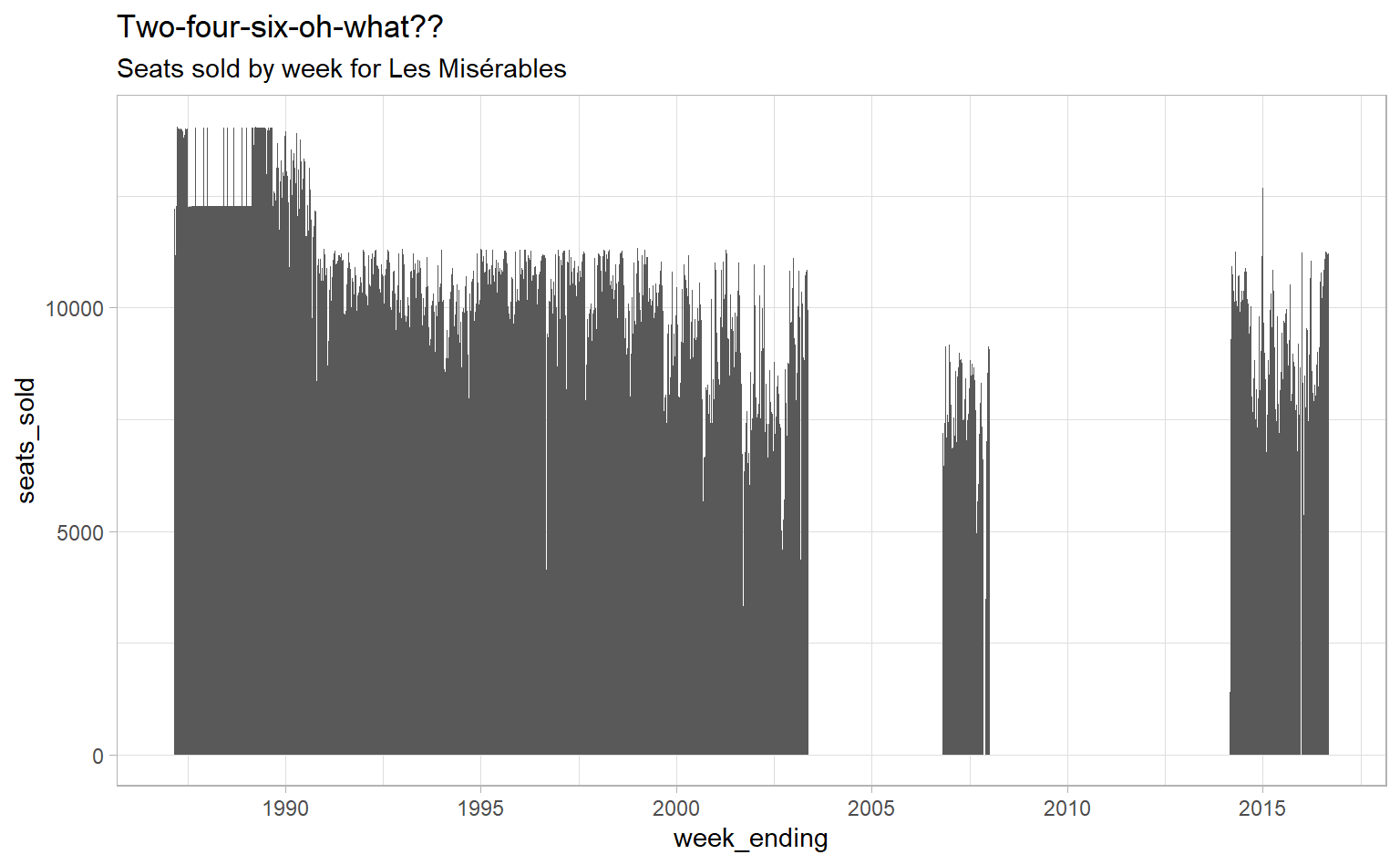
Why are there two big gaps? Well, Les Misérables, like many Broadway shows, has had multiple runs – an original run and two revivals in this case:
- 1987-2003 (Original)
- 2006-2008 (Revival #1)
- 2014-2016 (Revival #2)
But they all have the same show name in our data. So when figuring out which week of a run a show is in, we can’t just count the number of weeks since it first showed up in our data. We also need to figure out whether a show has started a fresh new run. I don’t want to look that up manually for – *checks notes* – 1,122 shows, so we need a heuristic to do that.
I’m going to assume that the first time a show appears is its first run. (This isn’t technically true for shows that opened and closed before our dataset starts in 1985, like The King and I, but it’s close enough for our purposes.) I’m also going to assume that a show has started a new run if it has been more than 90 days – about 12 weeks – since the previous time it appeared in the data. I chose 90 days because it’s long enough to account for shows that shut down briefly, which they sometimes do for things like moving to a new theatre. It’s also short enough that it won’t accidentally consider seasonal productions, which might appear in consecutive years, the same run.
Fortunately, we can do that in a few lines of code:
- Grouping by show, for each observation, check whether it is the first time it appears OR whether it is more than 90 days since the previous week in the data. This will return a logical value
TRUEorFALSE, which indicate the first week of a new run. - Use the cumulative sum function
cumsum()to determine the run number.RcoercesTRUEto one andFALSEto zero, socumsum()acts as a counter that only increases when it hits a new run’s first week (which we calculated in step 1). - Group by show and run number and use
row_number()which counts the rows as they appear in the data. Since each show and run is its own group, you get the week of the run!
grosses_clean_temp <- grosses_fixed_missing %>%
  group_by(show) %>%
  arrange(week_ending) %>%
  mutate(run_number = cumsum(row_number() == 1 |
                               week_ending - lag(week_ending) > 90)) %>%
  group_by(show, run_number) %>%
  mutate(week_of_run = row_number()) %>%
  ungroup()
But remember when I said there were two reasons this one’s tricky? Here’s the second reason. The shows that appear in the very first week of our dataset, June 1985, had already been running for some period of time. I don’t want to say that the first week of Cats was in 1985 when it was actually in 1982. Fortunately, there are only 19 shows where this is the case, so this time we can look it up manually. I searched the Internet Broadway Database for starting dates for each of these shows and added them as a separate file in the data’s GitHub repository.
To calculate the actual week of a show’s run – which we only need to do for shows that appear in the very first week of our dataset – we can write a function to calculate the number of weeks between the start date I looked up and the beginning of the dataset.
pre_1985_starts <- readr::read_csv("https://raw.githubusercontent.com/tacookson/data/master/broadway-grosses/pre-1985-starts.csv")

calculate_weeks_since_start <- function(x) {
  as.integer(pmax(1, difftime("1985-06-09", x, units = "weeks")))
}

pre_1985_starts_calculated <- grosses_clean_temp %>%
  group_by(show, run_number) %>%
  filter(min(week_ending) == "1985-06-09") %>%
  ungroup() %>%
  select(week_ending, show) %>%
  left_join(pre_1985_starts, by = "show") %>%
  group_by(show) %>%
  mutate(week_of_run_originals = calculate_weeks_since_start(start_date) + row_number()) %>%
  ungroup() %>%
  select(week_ending, show, week_of_run_originals)

grosses_clean <- grosses_clean_temp %>%
  left_join(pre_1985_starts_calculated, by = c("show", "week_ending")) %>%
  mutate(week_of_run = coalesce(week_of_run_originals, week_of_run)) %>%
  select(-week_of_run_originals)
Convert nominal to real dollars
Our final cleaning step is more straightforward. We need to match our (monthly) CPI values to our (weekly) grosses data and convert all the dollars to the same period of time – I’m going to use January 2020. To do that, let’s first convert the CPI value to multiplier that will give us Jan 2020 dollars. We do that by taking the Jan 2020 value and dividing it by the CPI value for every other month.
cpi <- cpi_raw %>%
  mutate(jan_2020_dollars = cpi[year_month == "2020-01-01"] / cpi)
So, if we want, say, Nov 1988 dollars in their Jan 2020 equivalent, we just use our newly-calculated multiplier. ($100 in Nov 1988 is equivalent to about $212 in Jan 2020).
Now we need to get our weekly grosses data to be monthly. We can use the {lubridate} package’s floor_date() function, which can round dates down to the first of the month. Then, we join the cpi data based on month and multiply all the dollar figures by our Jan 2020 mulitiplier.
real_grosses <- grosses_clean %>%
  mutate(year_month = floor_date(week_ending, unit = "month")) %>%
  left_join(cpi, by = "year_month") %>%
  mutate_at(
    vars(
      weekly_gross_overall,
      weekly_gross,
      potential_gross,
      avg_ticket_price,
      top_ticket_price
    ),
    ~ . * jan_2020_dollars
  ) %>%
  select(-year_month:-jan_2020_dollars)
Ahhhh, feels good to have nice, clean data. We can finally start answering our questions!
What are the most successful Broadway shows?
Let’s talk MONEY. Which shows have made the most? Shows like Hamilton have been raking it in, but it’s a fairly new show. Some shows have been on Broadway for decades and have had tons of time to make money over their runs. Let’s find the top 10 most financially successful shows. We’re going to look at a show’s cumulative gross box office receipts for every week in its run. We’ll get a sense of the overall revenue and of which shows have had shorter and longer runs.
(I’m also going to add a few fields that will be useful when graphing, like the year of a show’s run and a label of the show name that exists only for the most recent data point, which is useful for direct labelling.)
cumulative_grosses_by_year <- real_grosses %>%
  mutate(year_of_run = week_of_run / 52) %>%
  group_by(show, run_number) %>%
  mutate(
    # Use coalesce() for shows that have some NAs
    weekly_gross = coalesce(weekly_gross, 0),
    cumulative_gross = cumsum(weekly_gross),
    show_label = ifelse(year_of_run == max(year_of_run), paste0(" ", show), NA_character_)
    ) %>%
  ungroup() %>%
  mutate(show_and_run = paste(show, run_number),
         show_and_run = fct_reorder(show_and_run, year_of_run, .fun = max))

# Create character vector of top 10 grossing shows
top_10_grossing <- cumulative_grosses_by_year %>%
  group_by(show_and_run) %>%
  summarise(show_total_gross = sum(weekly_gross)) %>%
  top_n(10, wt = show_total_gross) %>%
  pull(show_and_run)
## `summarise()` ungrouping output (override with `.groups` argument)Now that we have a vector of out top 10 shows, we can graph only those shows and add a bunch of code to fiddle with direct labels of the lines and text size.
cumulative_grosses_by_year %>%
  filter(show_and_run %in% top_10_grossing) %>%
  ggplot(aes(year_of_run, cumulative_gross, col = show_and_run)) +
  geom_line(size = 1) +
  geom_label(
    aes(label = show_label),
    size = 3,
    family = "Bahnschrift",
    fontface = "bold",
    hjust = 0,
    vjust = 0,
    label.size = NA,
    label.padding = unit(0.01, "lines"),
    label.r = unit(0.5, "lines")
  ) +
  scale_x_continuous(breaks = seq(0, 40, 5)) +
  scale_y_continuous(labels = label_dollar(scale = 1 / 1e6, suffix = "M")) +
  scale_colour_fish(option = "Epibulus_insidiator",
                    discrete = TRUE,
                    direction = 1) +
  expand_limits(x = 40) +
  labs(
    title = "Could Hamilton overtake The Lion King in...20 years?",
    subtitle = paste0("Cumulative box office receipts (Jan. 2020 dollars) for top 10 grossing shows since 1985"),
    caption = paste0("Source: Playbill\n",
                     "Note: Partial data for Cats, which started in 1982 (this data begins in 1985)"),
    x = "Year of run",
    y = ""
  ) +
  theme(
    legend.position = "none",
    text = element_text(family = "Bahnschrift"),
    panel.grid.minor = element_blank(),
    axis.text = element_text(size = 10),
    axis.title = element_text(size = 9)
  )
The Lion King is the most successful Broadway show, with a cumulative gross of over $2 billion! Long-running popular shows like The Phantom of the Opera and Wicked have also been extremely successful. If you know Broadway, the others probably won’t come as a surprise.
Something I found interesting was how well Hamilton has done in such a short period of time. Its slope is the steepest, which means it is making money the fastest. It is also the most successful show compared to others at the same point in their run. Hamilton, at just under 5 years into its run, has made $673 million. The Lion King, at the same point in its run? “Only” $329 million, less than half. Will Hamilton keep its momentum and eventually overtake The Lion King?
How have ticket prices changed over time?
Top ticket prices
Let’s switch to the consumer side of things. I’ve been to a few Broadway shows with decent, but by no means top-tier, seats. The tickets worth the price, but they were definitely expensive. What if I were rich, though, and I was in the market for the best tickets money could buy? How much would that cost me?
top_tickets <- real_grosses %>%
  mutate(year = year(week_ending)) %>%
  filter(year >= 1996,
         !is.na(top_ticket_price)) %>%
  group_by(year, show) %>%
  summarise(avg_ticket_price = mean(avg_ticket_price, na.rm = TRUE),
            avg_top_ticket_price = mean(top_ticket_price, na.rm = TRUE)) %>%
  mutate(annotated = (show == "The Producers" & between(year, 2002, 2003)) | show == "Manilow on Broadway") %>%
  ungroup() %>%
  mutate(is_hamilton = show == "Hamilton")
## `summarise()` regrouping output by 'year' (override with `.groups` argument)avg_top_tickets_by_year <- top_tickets %>%
group_by(year) %>%
summarise(avg_top_ticket_price = mean(avg_top_ticket_price))## `summarise()` ungrouping output (override with `.groups` argument)top_tickets %>%
ggplot(aes(year, avg_top_ticket_price)) +
geom_jitter(data = top_tickets %>% filter(!annotated, !is_hamilton),
position = position_jitter(width = 0.2),
shape = 19,
size = 2,
col = "grey80",
alpha = 0.5) +
geom_point(data = top_tickets %>% filter(annotated),
size = 2,
col = "black") +
geom_point(data = top_tickets %>% filter(is_hamilton),
col = "#d1495b",
size = 4) +
geom_line(data = avg_top_tickets_by_year,
size = 1.5,
col = "darkblue") +
scale_x_continuous(breaks = seq(1996, 2020, 2)) +
scale_y_continuous(breaks = seq(0, 1000, 100),
labels = dollar_format()) +
annotate("text", x = 2018.5, y = 920, family = "Bahnschrift", label = "Hamilton", col = "#d1495b") +
annotate("curve", x = 2011, y = 775, xend = 2012.95, yend = 795, curvature = 0.3, arrow = arrow(length = unit(2, "mm"))) +
annotate("text", x = 2010.9, y = 780, family = "Bahnschrift", label = "Manilow on Broadway", hjust = "right") +
annotate("curve", x = 2003.5, y = 590, xend = 2002.05, yend = 655, curvature = -0.3, arrow = arrow(length = unit(2, "mm"))) +
annotate("curve", x = 2003.5, y = 590, xend = 2003, yend = 655, curvature = -0.3, arrow = arrow(length = unit(2, "mm"))) +
annotate("text", x = 2003.5, y = 590, family = "Bahnschrift", label = "The Producers", hjust = "left") +
labs(title = "Premium Broadway experiences have become much pricier",
caption = paste("Source: Playbill",
"Points are average top ticket price per show",
"Blue line is average top ticket price for all shows",
sep = "\n"),
subtitle = "(Especially if you want to see Hamilton)",
x = "",
y = "") +
theme(text = element_text(family = "Bahnschrift"),
panel.grid.minor = element_blank())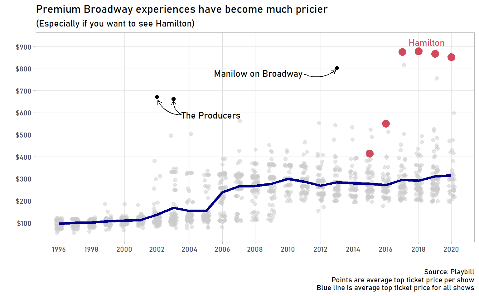
I have so many observations. First, Hamilton’s prices are unprecedented. For four straight years, the average top ticket price has been over $800! The only other shows that have even come close tend to be short-run musicians or comedians, like Manilow on Broadway in 2013 or Dave Chapelle on Broadway in 2019. It does look like the Hamilton hype might be easing – top ticket prices were down slightly in 2019 and down a slight bit more for the first part of 2020.
Second, was The Producers the Hamilton of its time? I have no trouble believing it. For part of its run, The Producers starred Matthew Broderick and Nathan Lane! Be still, my heart!
Third, top ticket prices jumped in 2006, from an average of $150 to $250 (in Jan 2020 dollars). What happened here? Did theatres start offering more bells and whistles with premium tickets and start charging more accordingly? Maybe there was simply a surge in demand that drove the prices up? Maybe there’s a separate explanation or a combination of both these things.
Average ticket prices
I’m not rich, so I’m more likely to be paying average ticket prices than top ticket prices. How have those changed?
avg_tickets <- real_grosses %>%
  mutate(year = year(week_ending)) %>%
  filter(!is.na(avg_ticket_price)) %>%
  group_by(year, show) %>%
  summarise(avg_ticket_price = mean(avg_ticket_price, na.rm = TRUE),
            performances = sum(performances)) %>%
  ungroup()
## `summarise()` regrouping output by 'year' (override with `.groups` argument)avg_tickets_by_year <- avg_tickets %>%
group_by(year) %>%
summarise(avg_ticket_price = weighted.mean(avg_ticket_price, w = performances))## `summarise()` ungrouping output (override with `.groups` argument)avg_tickets %>%
ggplot(aes(year, avg_ticket_price)) +
geom_jitter(position = position_jitter(width = 0.2),
shape = 19,
size = 2,
col = "grey80",
alpha = 0.5) +
geom_line(data = avg_tickets_by_year,
size = 1.5,
col = "darkblue") +
scale_x_continuous(breaks = seq(1984, 2020, 2)) +
scale_y_continuous(labels = dollar_format()) +
labs(title = "The cost of a Broadway experience has doubled in the past 35 years",
subtitle = "Inflation-adjusted average ticket prices (Jan. 2020 dollars)",
caption = paste("Source: Playbill",
"Points are average ticket price per show",
"Blue line is average ticket price for all shows",
sep = "\n"),
x = "",
y = "") +
theme(text = element_text(family = "Bahnschrift"),
panel.grid.minor = element_blank())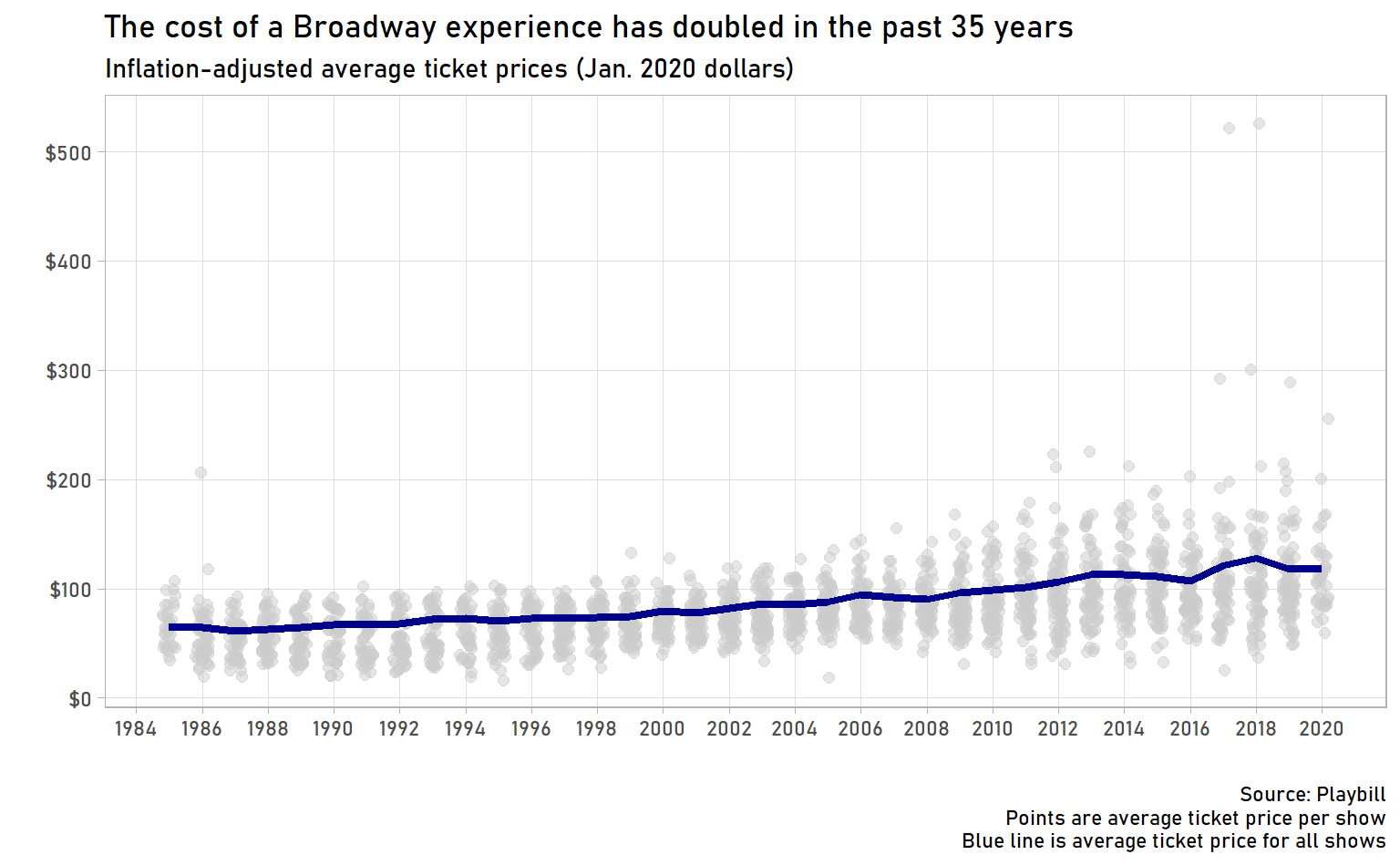
This graph is less dramatic than the one for top ticket prices, but it’s still interesting. First, inflation-adjusted ticket prices have doubled in the past 35 years. The average ticket in 1985 would cost $65, but in 2020 it would be $119. Keep in mind, these are inflation-adjusted dollars, so it really has gotten quite a bit more expensive to see a Broadway show.
Second, we start seeing more high-priced outliers starting around 2010. (Though there is a notable outlier in 1986, The Life Adventures of Nicholas Nickleby.) Does this mark the start of the era of supershows – must-see shows that command much higher prices?
Third, we have to talk about those outliers in 2017 and 2018. Any guesses on what show it is? I would understand if your guess was Hamilton, but even though Alexander Hamilton was young, scrappy, and hungry, he wasn’t Born to Run. That’s right, the highest average ticket prices were to see The Boss himself, Bruce Springsteen!
Conclusion
We’ve learned some things about the money side of Broadway shows, including what the most financially successful shows have been, how ticket prices have changed over time, and just how much money people are willing to pay to see Springsteen. We could ask many more questions, including:
- Does source material have an impact on grosses? For example, are “movie musicals” like Aladdin, Frozen, or Mean Girls more (or less) successful?
- Does winning Tony Awards cause a bump in ticket prices or grosses?
- Is there any seasonality in ticket prices or attendance? Maybe summer- or Christmas-time are particularly profitable.
- Do big-name stars have an effect on ticket prices or attendance? I’d definitely pay more to see a show starring Idina Menzel or Nathan Lane.
If you’re curious about these (or other questions!), feel free to use this data to look into them yourself! And, if you enjoyed this post, please let me know on Twitter.